FREE Shipping on orders over $1000


a two destination love story, from hyderabad to melbourne
Some weddings feel layered from the very beginning.
M+C’s was one of them.
With celebrations unfolding across two countries, Hyderabad and Melbourne, the design process naturally began with place. Two destinations. Two energies. One cohesive story.

The invitation suite set the tone. Refined serif typography anchored the layout, softened by a romantic script woven delicately through their names. The structure felt modern and intentional, while the paper choice added warmth and tactility. It was timeless, but never flat. Elegant, but still personal.
The Hyderabad events were detailed within the insert, honouring the multi day celebrations, while Melbourne brought its own understated refinement. Rather than treating them as separate weddings, we designed the suite to travel beautifully between both worlds.

considered details, layered softly
When guests arrived in Melbourne, the styling carried that same quiet sophistication through every touchpoint.

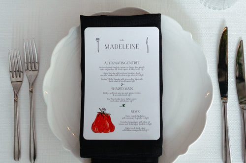
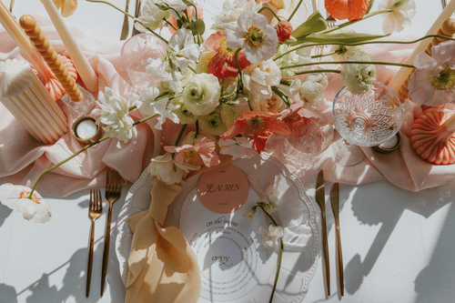
Landscape DL menus elongated each setting, sitting gently atop clear plates with gold rims. Round place cards added a subtle contrast in shape, each one personalised for every guest. A small detail, but one that always changes how a table feels. Intentional. Considered. Warm.
The ceremony menu featured a sculptural curved edge, a shape that became a recurring motif across the day. The bar signage echoed the same form, creating cohesion without feeling repetitive. Every piece spoke to the next.
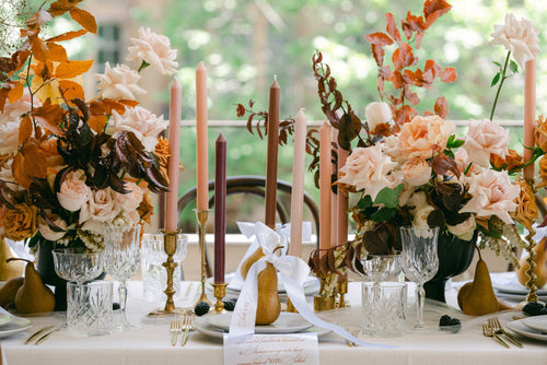
The palette remained soft and romantic. White florals layered with blush and subtle green tones. Candlelight. Clean lines. Nothing overwhelming the space, just enhancing it.


the space
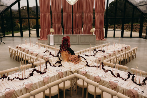
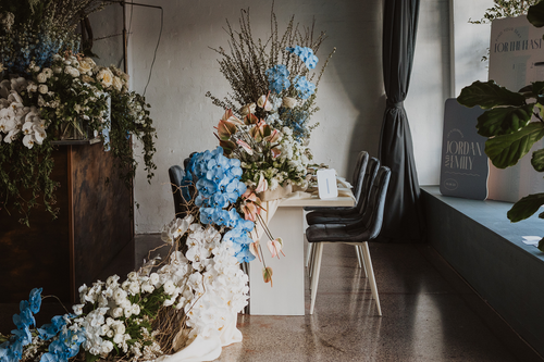
Set within the modern architectural lines of Hubert Estate, the reception felt expansive yet intimate. Long tables drew the eye down the room, creating rhythm and balance beneath the timber ceiling. Florals ran the length of the tables, punctuated by tall taper candles and refined stationery moments.


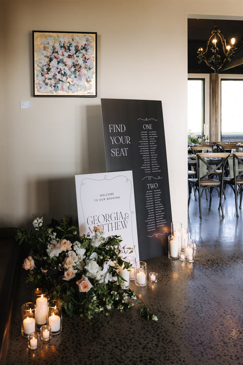
The black seating chart provided contrast against the softness of the florals, grounding the space and adding depth. A simple typographic statement that felt bold, but still elegant.
Even the smallest signage moments, from the “please leave your wishes” card to table numbers, were designed to feel like part of the story, not an afterthought.
the finishing touches
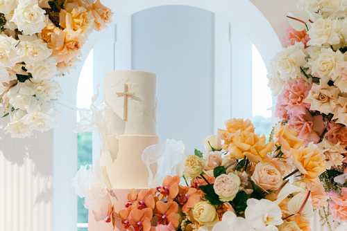
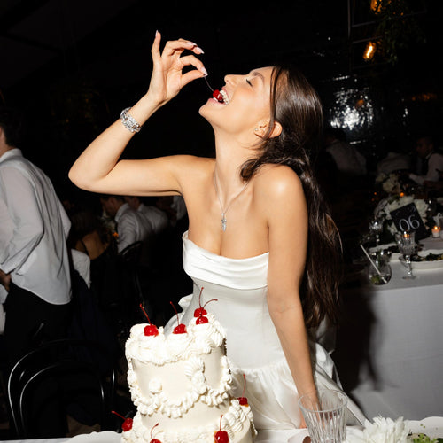
The cake, covered in fresh raspberries, added a playful richness to the otherwise soft palette. A quiet pop of colour. A moment.
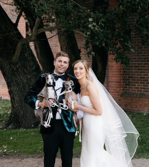
And then, of course, M+C themselves. Effortless. Joyful. Completely at ease.


From vineyard portraits to architectural backdrops, their celebration felt both grand and intimate at the same time. A wedding that honoured heritage, embraced modern design, and remained deeply personal throughout.

Two destinations.
One love story.
One cohesive design from beginning to end.
•
event management & styling: @lnr_events_
event photographer & videographer: @love.and.other
venue: @harrietthubertestate @hubert_estate
florist: @aschajolie
event stationery: @adelphimou
tableware: @eventmerchantco
napkins: @tablearteventhire
content creator: @socialavenue.studio
styling photographer: @emmahawkins_photography
dj & mc: @musicwithmemories
entertainment: @darioviolin
wedding cake: @forheavenscake.olivia
ceremony backdrop: @hazeleventsprophire
alcoholic icypoles: @lapopsaustralia